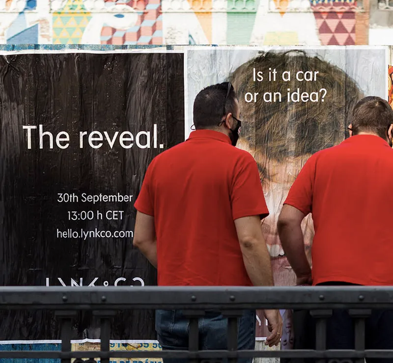
The importance of design in poster pasting
Poster pasting is considered a highly important advertising medium made up of images or texts whose function is to capture attention by perceiving a clear message as a “scream on the wall”. Despite the years that have gone by, poster pasting remains a social phenomenon that has become part of the urban landscape of our cities.
To do a poster pasting and make our poster effective, we must give great importance to design. Size and the impact a poster causes can go hand in hand on many occasions, but there are some fundamental points that will help its graphic design achieve an impact on our audience. Therefore, we leave you some recommendations to take into account when designing it.
The most important information must be legible from afar; the design must be intriguing enough for people to stop and read even the smallest lettering. Try to avoid unnecessary text. It is important to include information in just the right measure, since an excess of information can be counterproductive and we can saturate it or make it boring to understand for the receiver.
The image is the strongest point of the poster; it will be the first thing that reaches our potential customers and will impose itself even over the text. It is estimated that for 2 to 4 seconds we are receiving advertising information, so the first impact we must give the consumer will depend on these images and the colors we use, thus capturing their attention so that the message arrives in full. A poster that does not have striking images or colors will not arouse the interest of the person who views it and therefore will not correctly fulfill its function. Equally important is not to oversaturate the visual aspect too much. Confusing our potential customers is a mistake we must not fall into; in fact, it is preferable to work within simplicity, with clear and clean messages.
Making sure there is a lot of contrast between the key elements of your poster and the rest is essential (e.g., if your poster is dark, use a white font and vice versa). Some places have very dim lighting, so using colorful fonts on the poster may look good on a computer screen, but when it comes to pasting posters on the street, it may not be a good idea.
Try not to use more than two fonts. Have several weights, useful for the different elements of the poster. Don’t forget to pay attention to alignment.
Check the information, spelling, and that everything is fine and no important data is missing several times. This will help you appear more professional and will create a good image.
Resolution is very important, so the final file must be in CMYK format at 300 dpi so that it does not look pixelated or blurry.
If you do not have the means or capabilities, you can consult our design department and we will help you.